Author: Chad Symens

A Better Method for Evaluating Store Performance

Evaluating Store Performance

Last week I had an interesting discussion with my team about a customer whose focus is on improving store performance at their retail customers in 2017.  This customer is well represented with their entire product line at all doors at their key accounts, so they want to ensure each door is producing the maximum number of sales.  In our experience, brands selling products through retailers most frequently grade store performance using total dollars sold. The most common report shows total dollars sold by store for a rolling 4-week period, YTD and rolling 52 weeks. Stores with the highest total sales are assumed to be the “best” doors.  However, the top line sales figure doesn’t really give you the entire picture of store performance. The stores might have different assortments and inventory allocation can vary by store resulting in lost sales due to out of stocks. Total dollars sold is more useful when you look at a single SKU across stores, but in this case the goal was to choose one KPI for a door across all SKU’s.

Metrics you might use to determine store productivity include:

  • Total dollars sold
  • Sell-Thru %
  • GMROI
  • Inventory turns
  • Gross margin $
  • Average dollars per week per store

Let’s take a look at five stores and see which one is the ‘best’ store.   The table in Figure 1 shows the total sales for five stores over the most recent 52 weeks.  With a little sorting of our data by dollars sold descending we can add a store rank and identify that store 4758 is the “best” store and store 3529 is the “worst”store.   See Figure 2.

Figure 1

Store Number Rolling 52 Week Sales
4758 $738,394
3529 $457,938
7847 $627,348
5463 $584,393
2737 $495,494


Figure 2

Store Number Rolling 52 Week Sales Store Rank
4758 $738,394 1
7847 $627,348 2
5463 $584,393 3
2737 $495,494 4
3529 $457,938 5


Unfortunately, this is where the analysis of store performance all too frequently ends. Using total sales as the only KPI doesn’t provide any information on the financial return of inventory in the store. The sales could be very high, but the margins might be very thin, or even negative, and what appears to be a very high performing store could actually be unprofitable.

A better KPI for evaluating store performance is gross margin return on investment (GMROI).  GMROI tells you how much profit your inventory generated. For example, if your GMROI is 3.7 then your inventory returned $3.75 for every $1 dollar you invested into inventory.  A GMROI below 1 indicates you are losing money on every $1 dollar of inventory. For a refresher on how to calculate GMROI, visit our prior blog.

In Figure 3 we added the GMROI for each store and then in Figure 4 the stores are ranked by GMROI.    Notice store 4758 which was ranked number one based on total sales is actually fourth when you look at the GMROI. Store 5463 is creating $4.10 in profit for every dollar of inventory invested.

Figure 3

Store Number Rolling 52 Week Sales GMROI
4758 $738,394 2.7
7847 $627,348 3.2
5463 $584,393 4.1
2737 $495,494 3.9
3529 $457,938 1.7


Figure 4

Store Number Rolling 52 Week Sales GMROI Store Rank – TTL Sales Store Rank – GMROI
5463 $584,393 4.1 3 1
2737 $495,494 3.9 4 2
7847 $627,348 3.2 2 3
4758 $738,394 2.7 1 4
3529 $457,938 1.7 5 5


When you consider retailers invest 60% to 80% of their available capital into inventory it makes sense to use GMROI as the basis for evaluating store performance.  Here are some actions we recommend you take this quarter with your key retail accounts:

  1. Calculate GMROI by store.
  2. Calculate GMROI by brand by store.
  3. Ask your merchant for their GMROI target for your products.
  4. Do some research on GMROI for similar products.
  5. Create an exception report that highlights any store with a GMROI at or below 1. These are stores that need your attention.

 

Reducing Out of Stocks

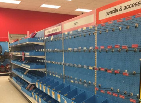
Probably three of the ugliest words for a retailer or vendor are — out of stock. Each and every time an out of stock (OOS) occurs, the retailer, vendor, and consumer lose. Revenues and profitability go down, and consumer frustration rises. This is not a newsflash; it’s easy to find a wealth of OOS research with a simple Google search. Thought leaders in the retail industry have been writing articles and funding research for decades to quantify the magnitude of the problem, diagnose root causes, and create solutions. The net benefit of all this work? Drum-roll please…. average OOS rates are holding steady at about 8% on average, with out of stocks for promoted items often exceeding 10%.

Out of Stock AnalysisAccording to a 2015 FMI/GMA Trading Partner Alliance Report, the problem is compounded by the growing importance of the user experience. Product availability is one of the top three reasons for where they shop, but during every shopping experience, one out of every 12 items on the shoppers list is not on the shelf. Additional data from the Grocery Manufacturers of America (GMA) and the Food Marketing Institute (FMI) Trading Partner Alliance shows an unsettling three-strikes-and-you’re-out pattern. A typical shopper will substitute another item on the first occurrence of an out-of-stock 70 percent of the time; on the second occurrence the shopper is equally likely to substitute, make no purchase, or go to another store; and on the third occurrence, 70 percent will go to another store. In addition to the potential for lost revenue from the out-of-stock item itself, there is also the potential for loss of future revenue streams from lost brand and/or store loyalty.

I recently had an opportunity working with a customer to help them quantify the impact out of stocks were having on their sales. We developed a Lost Dollars sold report which calculates the dollars lost by week for a SKU across all the stores at their largest retail customer.  The report is pretty simple – it identifies every out of stock for a period of time, in this case the most recent four weeks, and then calculates the average rate of sale by store.  Since the average unit retail price is known, we can calculate the estimated sales lost by looking at the units which would have been sold had the product been in stock, and multiply that number by the average unit price. The customer I was working with was shocked to see that out of stocks at their largest retail customer was costing them a little over $3,500 per week.  That added up to about $14,000 for the four-week period we analyzed. The customer took our report to their replenishment manager, along with a recommendation to place an order sufficient to cover the next eight weeks of expected demand.  The end result was an increase in sales of 3.5%!

We often have conversations with customers where they cite an in-stock rate of 99%. But, when you’re out of stock 1% of the time, the financial impact can add up quickly.  The customer I referenced above was running at 99.1% in stock, and we still increased their sales!

Reducing out of stocks is a complex problem, with many moving parts and multiple parties that have to execute in harmony, or the entire system breaks down. But, you can’t manage and improve what you are not measuring. And it’s hard to believe a vendor is making an effort to reduce OOS if they are not measuring on-hand at their retail customers. If you are a vendor dependent on a retailer maintaining good shelf availability to grow your sales, then you need to proactively manage in-stock. That means, if your retailer makes POS activity available at midnight Sunday, your team should be taking action by 11:00 am Monday morning. Not just loading data into a spreadsheet, so they can start the analysis process. Or worse yet, not even receiving any data at all. Timely reporting and analysis on your in-stock and out-of-stock data across your retailers is a proactive step toward battling that steady, average out of stock rate of 8%.

For additional information, download out whitepaper titled Out of Stock Analysis available in the resource center.

Data-Driven Series: Know Your Customer Type

Data Analysis

Both The Home Depot and Lowe’s continue to focus on the “Pro” customer as the key growth driver for sales. In the case of The Home Depot, there are some interesting store attributes available to vendors, which The Home Depot uses as store descriptors. Last week, I was working with one of our customers who sells product at The Home Depot, and I had an opportunity to help them prioritize where to focus their efforts in 2017. I recommended they spend time identifying, analyzing, and creating specific sales plans for all Pro stores.

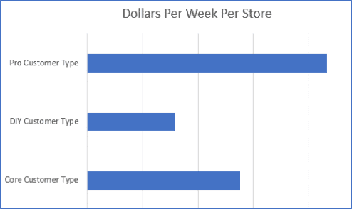
To get the conversation started, I showed the vendor a simple summary of dollars per week, per store by customer store type. There are three customer store types: Pro, DIY and Core. Figure 1 shows the average weekly sales by the customer store type. The Pro stores are clearly leading the group in average weekly sales per store by a substantial amount (Figure1).
Dollars Per Week Per Store
Among their 2,200 stores in North America, about 300 Home Depot stores have the Pro customer type attribute. This subset of stores is easily analyzed on a deep dive basis, and results can have a substantial impact on your total sales if you create the correct strategies and execute them well.

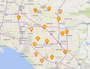
To help my customer understand the importance of the store customer type attribute, I pulled 2016 sales for The Home Depot stores in the Anaheim, CA market. If you simply type Anaheim into the homedepot.com store finder you will get back a list of 16 stores. Then, I looked at the total sales by store for each store, and segmented them based on customer type. In the Anaheim market, 12 stores are tagged as Pro stores, 4 stores are tagged as Core, and zero stores are tagged as DIY. Figure 2 identifies the Pro stores with a yellow tag and the Core stores using a white tag. The Pro stores averaged an additional 21% in sales compared to the Core stores.
Sell Thru Time

As we discussed how to leverage this information, I asked the VP of Marketing to pull a list of display promotions for 2016 in the Anaheim market. They ran two displays last year in the market – one in the spring and one in the fall. Each display was a pallet display in the aisle, at the front of their department, with 48 units of product. The average sell-thru time at the Pro stores was 3.75 weeks. The average sell-thru time at the Core stores was 5.35 weeks. The Pro stores are clearly superior when it comes to a high sell thru on a display, and we concluded it would not make sense to ship a display to the 4 Core stores in 2017. Instead, they are allocating those displays to four Pro stores in the Sacramento market. Based on 2016 sales we would expect those displays to perform at similar sell-thru to the Pro stores in Anaheim. Those Sacramento stores did not have a display last year so the sales will represent net new dollars for 2017.

Working to gain an in-depth understanding of stores and their attributes can seem like an overwhelming task when you first tackle the project. With thousands of stores and about three dozen attributes, there are a lot of variables to consider. I find it’s helpful to start with the attributes you hear Home Depot executives focusing on, and then move along to other attributes as you gain efficiency in your analysis. The Home Depot (and Lowe’s) are both very focused on the Pro, which means you should be as well.

DATA-DRIVEN Series: What You Can Learn From Your Average Retail Selling Price

Data Analysis

Last week, I had the opportunity to work with two different customers analyzing their sales at The Home Depot.  One sells products in the paint department and the other sells into the building materials department.  The analysis goal for both customer projects was to deconstruct their YTD sales and identify the factors contributing to higher than expected comp sales increases.  Both customer’s sales for a set of key SKU’s were up about 2.5% YoY and the question they wanted answered was, “What is driving the higher sales, and will it continue?”

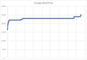
Average Retail PriceAs we deconstructed their respective sales into its component parts of distribution, price, and rate of sale, we uncovered interesting data regarding average retail selling price.  The first customer’s average retail price was pretty consistent across Home Depot stores at the expected $22.95 retail price.  There were some fluctuations, but the data was pretty clustered, as expected.


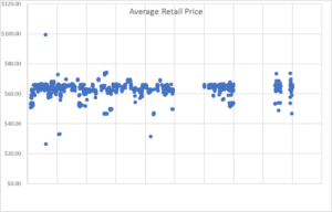
In contrast, the second customer’s average retail price was very inconsistent.  Customer #2 believed that The Home Depot was pricing their core SKU at $59.95 or $65.95, depending on the market.  However, as you can see in Figure 2, the pricing was very inconsistent across stores.  In fact, we identified stores in the same Home Depot market with a selling price variance of $28.35 per unit.

Home Depot EDI

While there can be good reasons to price a product differently by market due to shipping costs or competitive pressures, it seems irregular to have different prices within the same market.  Take a look at the average retail price of your products. It’s an important exercise that can yield some interesting insights.  It presents an opportunity to have a conversation with your merchant about pricing strategies.  And, It also provides an opportunity to identify markets with similar demographic profiles, but different selling prices, thus providing insight into what price point drives the highest sales.

Does your average selling price match your expectations?  The answer may not be as simple as you think and could reveal some interesting insights.

Home Depot EDI