 Mark Twain famously said, “get your facts first, then you can distort them as you please.” As data analyst we have a responsibility to provide an accurate and complete picture when we poor through numbers and create reports. The labor report released on Friday provides a great example of an incomplete reporting of the facts.
If I told you sales for last quarter are up 5% from the prior quarter that would be good news right? But what if I failed to tell you sales for the company’s three new products had fallen 35%. That would be a key piece of information that might change your view on the company’s performance last quarter. Friday’s unemployment report, while good news, only tells part of the story. Here is the positive part – nonfarm payrolls rose a seasonally adjusted 271,000 in October taking the unemployment rate down to 5%. Average hourly earnings of private sector workers rose at a 2.5% annual pace in October.
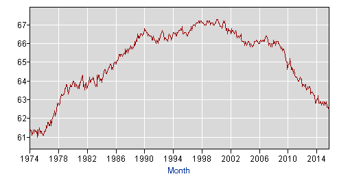
However, here is the part which was not included in most of the news stories… the labor force participation rate remained unchanged from September at 62.4, and the labor force participation rate has not been that low since 1978. (see accompanying chart) 94,513,000 Americans who are working age are not working or actively seeking a job. Retiring baby boomers explains about half of the drop in the participation rate and that trend will continue. The second factor is that people are choosing to go back to school or stay in school longer. The number of individuals enrolled in post-secondary degree granting institutions ballooned to more than 52 percent between 1990 and 2014 according to the National Center for Education Statistics. Another factor is a sharp increase in the number of Americans on disability. With an aging labor force that trend is also expected to continue.
As data analysts our job is to tell the entire story – the good and the bad – so that quality decisions can be made.


